splot.giddy.dynamic_lisa_heatmap
- splot.giddy.dynamic_lisa_heatmap(rose, p=0.05, ax=None, **kwargs)[source]
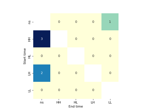
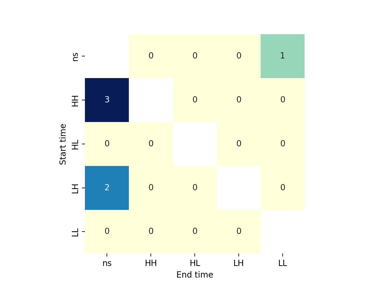
Heatmap indicating significant transition of LISA values over time inbetween Moran Scatterplot quadrants
- Parameters
- rosegiddy.directional.Rose instance
A
Roseobject, which contains (among other attributes) LISA values at two points in time, and a method to perform inference on those.- pfloat, optional
The p-value threshold for significance. Default =0.05
- axMatplotlib Axes instance, optional
If given, the figure will be created inside this axis. Default =None.
- **kwargskeyword arguments, optional
Keywords used for creating and designing the heatmap. These are passed on to seaborn.heatmap(). See seaborn documentation for valid keywords. Note: “Start time” refers to y1 in Y = np.array([y1, y2]).T with giddy.Rose(Y, w, k=5), “End time” referst to y2.
- Returns
- figMatplotlib Figure instance
Heatmap figure
- axmatplotlib Axes instance
Axes in which the figure is plotted
Examples
>>> import geopandas as gpd
>>> import pandas as pd
>>> from libpysal.weights.contiguity import Queen
>>> from libpysal import examples
>>> import numpy as np
>>> import matplotlib.pyplot as plt
>>> from giddy.directional import Rose
>>> from splot.giddy import dynamic_lisa_heatmap
get csv and shp files
>>> shp_link = examples.get_path('us48.shp')
>>> df = gpd.read_file(shp_link)
>>> income_table = pd.read_csv(examples.get_path("usjoin.csv"))
calculate relative values
>>> for year in range(1969, 2010):
...     income_table[str(year) + '_rel'] = (
...         income_table[str(year)] / income_table[str(year)].mean())
merge to one gdf
>>> gdf = df.merge(income_table,left_on='STATE_NAME',right_on='Name')
retrieve spatial weights and data for two points in time
>>> w = Queen.from_dataframe(gdf)
>>> w.transform = 'r'
>>> y1 = gdf['1969_rel'].values
>>> y2 = gdf['2000_rel'].values
calculate rose Object
>>> Y = np.array([y1, y2]).T
>>> rose = Rose(Y, w, k=5)
plot
>>> dynamic_lisa_heatmap(rose)
>>> plt.show()
(Source code, png, hires.png, pdf)
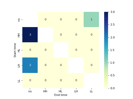
customize plot
>>> dynamic_lisa_heatmap(rose, cbar='GnBu')
>>> plt.show()
