splot.esda.plot_local_autocorrelation
- splot.esda.plot_local_autocorrelation(moran_loc, gdf, attribute, p=0.05, region_column=None, mask=None, mask_color='#636363', quadrant=None, aspect_equal=True, legend=True, scheme='Quantiles', cmap='YlGnBu', figsize=(15, 4), scatter_kwds=None, fitline_kwds=None)[source]
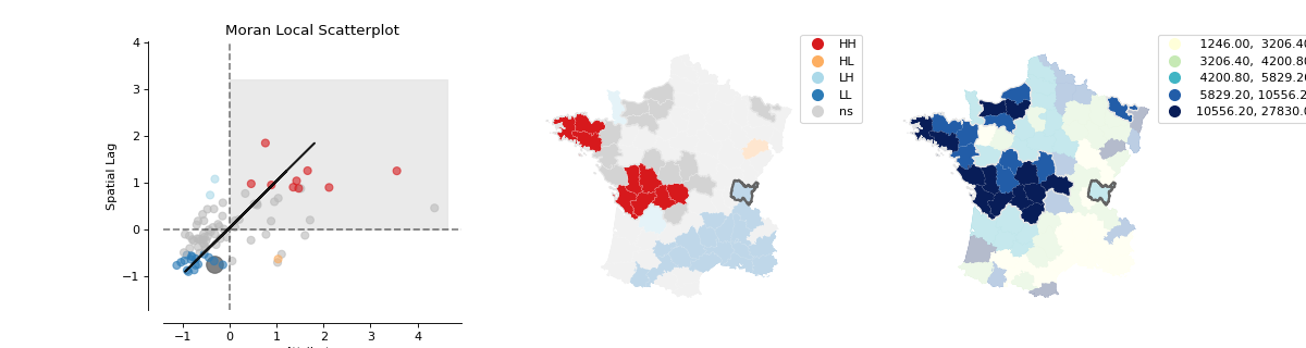
Produce three-plot visualisation of Moran Scatteprlot, LISA cluster and Choropleth maps, with Local Moran region and quadrant masking
- Parameters
- moran_locesda.moran.Moran_Local or Moran_Local_BV instance
Values of Moran’s Local Autocorrelation Statistic
- gdfgeopandas dataframe
The Dataframe containing information to plot the two maps.
- attributestr
Column name of attribute which should be depicted in Choropleth map.
- pfloat, optional
The p-value threshold for significance. Points and polygons will be colored by significance. Default = 0.05.
- region_column: string, optional
Column name containing mask region of interest. Default = None
- mask: str, float, int, optional
Identifier or name of the region to highlight. Default = None Use the same dtype to specifiy as in original dataset.
- mask_color: str, optional
Color of mask. Default = ‘#636363’
- quadrantint, optional
Quadrant 1-4 in scatterplot masking values in LISA cluster and Choropleth maps. Default = None
- aspect_equalbool, optional
If True, Axes of Moran Scatterplot will show the same aspect or visual proportions.
- figsize: tuple, optional
W, h of figure. Default = (15,4)
- legend: boolean, optional
If True, legend for maps will be depicted. Default = True
- scheme: str, optional
Name of PySAL classifier to be used. Default = ‘Quantiles’
- cmap: str, optional
Name of matplotlib colormap used for plotting the Choropleth. Default = ‘YlGnBu’
- scatter_kwdskeyword arguments, optional
Keywords used for creating and designing the scatter points. Default =None.
- fitline_kwdskeyword arguments, optional
Keywords used for creating and designing the moran fitline in the scatterplot. Default =None.
- Returns
- figMatplotlib figure instance
Moran Scatterplot, LISA cluster map and Choropleth.
- axslist of Matplotlib axes
Lisat of Matplotlib axes plotted.
Examples
Imports
>>> import matplotlib.pyplot as plt
>>> from libpysal.weights.contiguity import Queen
>>> from libpysal import examples
>>> import geopandas as gpd
>>> from esda.moran import Moran_Local
>>> from splot.esda import plot_local_autocorrelation
Data preparation and analysis
>>> guerry = examples.load_example('Guerry')
>>> link_to_data = guerry.get_path('guerry.shp')
>>> gdf = gpd.read_file(link_to_data)
>>> y = gdf['Donatns'].values
>>> w = Queen.from_dataframe(gdf)
>>> w.transform = 'r'
>>> moran_loc = Moran_Local(y, w)
Plotting with quadrant mask and region mask
>>> fig = plot_local_autocorrelation(moran_loc, gdf, 'Donatns', p=0.05,
...                                  region_column='Dprtmnt',
...                                  mask=['Ain'], quadrant=1)
>>> plt.show()
(Source code, png, hires.png, pdf)